Every leading company in the automotive industry adopts a specific logo that expresses its identity, and among these logos is the Kia logo, which has gained wide popularity over the past few years in various countries around the world, prompting us to provide all the types produced by it through a car exhibition in the UAE, whether in Ajman or Sharjah.
Despite the great fame that this company enjoys, many people do not know what the story of its logo is, what it means, and what changes have occurred to it so far. This is what we present to you in the following article.
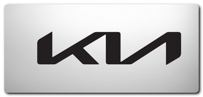
What does the Kia logo mean?
Kia, the leading company in the automotive manufacturing and production field, has continuously changed its logo over the past years, just like other companies, to suit the services it provides to its customers.
The Kia logo was launched based on the Korean word that is divided into two parts; ‘Ki’, which means to exit, and ‘A’, which symbolizes Asia, and this logo as a whole means exiting from Asia to the world.
This name is considered to be the message that the company wishes to convey to the world, and it has indeed succeeded; especially after it managed to become the second largest leading company in the automotive industry worldwide, coming from South Korea, which is located in the Asian continent.
What are the developments that have occurred to the Kia logo?
The Kia logo has not been in the same form since its first appearance in the 1940s; it has gone through many developments and stages until it appeared to us in this form, and in the following lines, we will clarify each stage individually.
- Kia logo 1944: It was the first logo that this company appeared with since its first appearance, and it was then represented by three diamonds; with a gear shape in the center; containing the company’s name, and this logo was when it was specialized in the production of bicycles and car parts; before moving towards the manufacturing and production of cars themselves.
- Kia logo 1964: Kia changed its official logo at the beginning of the 1960s, and it was necessary to take this step, especially after it moved into the field of car manufacturing. It chose a simple logo that reflected the significant changes that occurred within the company, which included a medium-sized green circle with a letter resembling ‘Q’ above it.
- Kia logo 1986: Kia Company reintroduced its original traditional logo, especially after it restored its name written in English with thick, clear letters, and in addition, the letter ‘K’ was placed above the entire word.
- Kia Logo 1994: In the early nineties of the last century, Kia decided to bring back simplicity and clarity to its logo, and it changed it to become a red circle with the word “KIA” beautifully and clearly in the center, accompanied by a white background. The main goal of the red color was to express the company’s field, indicating that it manufactures cars, while the white color signified loyalty and belonging.
- Kia logo 2004: It is considered a repetition of the previous version; it only made some minor changes, which consist of making the logo clearer, as well as darkening the color shades; in addition to highlighting its essence in the production and manufacturing of cars, and exporting them to all countries of the world.
- Kia logo 2020: It is considered the most modern logo that Kia has produced so far, and it is the logo officially adopted by the company to this day. It features a clearer quality for the company’s logo, with its letters intertwined and larger in size.
- This was alongside the removal of all the frames that were previously present, such as the circle and others, and its presence alone, and it was integrated into the cars that it released over the past four years, whether in red or black, with both colors indicating the strength and authority of the company, and its expansion in the world.
summary:
With the great popularity achieved by the releases of the Korean company Kia and its expansion in the United Arab Emirates, we have made all these releases available through our website 2020motors, and they are now available at the best and cheapest car showroom in the UAE, whether in Ajman, Sharjah, or elsewhere, and you can easily order them online by contacting us at our special numbers “00971565533556, and 00971502484380.”
If you have any inquiries about any type of car, please contact us, and we will provide you with all the information you wish to obtain immediately, especially since we offer you the service of purchasing new or used cars, as well as listing your cars for sale at the highest prices.